Raw / Component catalog
INK, PAPER.
REAL INTERFACES.
Twenty components, expressive interactions and configurable silhouettes. Explore the specimens, try the interaction laboratory or see the system in Jason’s portfolio. Native distribution certification is still in progress.
02 / Card
Only the exterior deforms. Select text or follow an action while the outline moves.
Project notes / Interface systems
Build resilient interfaces with clear boundaries between presentation, geometry and accessible behavior. This text remains selectable and its layout does not shake.
03 / Popover
Base UI owns placement and focus. Compare a scoped safe host with explicit body scope; grow the content while open.
04 / Scope checks
Nearest Shape and intensity win. Explicit Default restores its own palette and typography; Raw remains light under dark ancestry.
Default inside Raw
Raw under a dark ancestor
05 / Wave study
Canonical Raw Button effects and source-derived three-drawing comparisons, pending personal visual acceptance.
Temporary interaction laboratory. Combine independent visual tilt/scale, comic-frame morph and content wobble. Hover uses a precise pointer; the native target stays still.
Recorded actions: 0
Three drawings, 120ms per frame. Pulse hover finishes while you stay over the Button and replays after leaving and returning. Continuous morph is optional; set Morph to off or intensity to none to stop it. All specimens use the canonical Raw Button and effects API.
06 / Catalog · Batch 1
WORKING CONTROLS.
Stationary fields, familiar selection states and real semantic text. The accepted laboratory above remains unchanged; overlays and media follow in separate milestones.
Accordion
Tabs
OVERLAYS, NOT MOVING TARGETS.
No overlay action yet.
12 / Dialog & Command
Real modal focus, Escape and filtering. Paint is separate from stationary content; explicit body scope and a stable safe host are both available.
14 / Drawer & Sheet
Four directions, nested/snap drawers and long scrolling content. Base UI owns swipe/stack transforms. Navigation reuses canonical Button layers.
15 / Tooltip & Sonner
Tooltip arrow and text share rotation only; focus stays stationary. Sonner is locally mounted, framework-neutral and light-only.
Batch 2B / Media & decoration
A silhouette, not a second target.
Shadow never clips children. Mask accepts only native noninteractive images. Offsets and scale move the shadow, not the image or layout; image position is independent. Custom geometry is independent of the inherited Shape preset.
Alpha follows image transparency; fully opaque photos produce a rectangular shadow. Named and custom geometry independently draw contours.
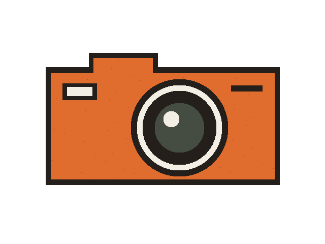
Alpha follows transparent pixels, not automatic photo contour detection. Use same-origin/CORS-loadable raster assets. Responsive srcSet uses named geometry instead of a potentially mismatched alpha mask.
Independent configuration render
Copy the effective configuration
Move the specimen to the shown caller-owned asset path (or replace src), and use your configured UI alias. The snippet includes scope, dimensions, effects and zero values. Samples are not installed dependencies.
Use aliases.ui from your components.json; empty input uses @/components/ui. The module suffix comes from the actual registry destination.
import { Silhouette } from "@/components/ui/raw/silhouette";

<div data-style={"raw"} data-shape={"irregular"} style={{"background":"var(--muted)"}}>
  <Silhouette
    offsetX={4}
    offsetY={6}
    scale={1}
    shadowOpacity={1}
    reveal={"always"}
    effects={{"intensity":"expressive","contentWobble":false,"tilt":false,"pulse":"off"}}
    media={{"src":"/raw-media/proof-camera.png","alt":"Original orange field camera illustration with a transparent background","width":640,"height":480,"objectPosition":"50% 50%"}}
    style={{"width":360,"maxWidth":"100%","aspectRatio":"4 / 3"}}
    mode={"shadow"}
    shape={"alpha"}
  />
</div>
Generic interactive content / shadow only
Saved 0 times
Real product link / reveal & press
Native anchor owns Enter, pointer hitbox and focus. Space keeps native link behavior; no fake image button.
Nearest Default / square / none

Media: original MiscellaneousUI field-camera raster; “Rainforest mountains”, Philipp Reiner (2014), CC0 1.0, via Wikimedia Commons. No reference artwork or textures copied.

Back to top
A scroll-aware control that returns to the top and moves focus to a meaningful target. Scroll inside the frame.
Floating actions
A fixed single action or an expandable disclosure of actions that opens toward the page interior. Scroll and interact inside the frame.